Community graphic
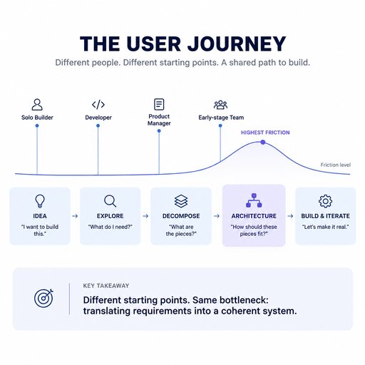
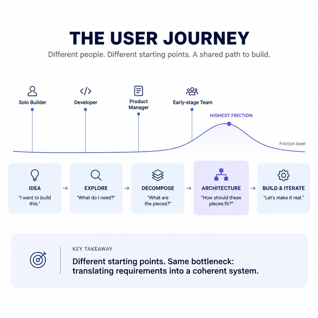
Yep 😂 — use this **as one Canva prompt**: > **Create a clean, minimal product-management presentation graphic titled “THE USER JOURNEY”. Show a horizontal 5-stage journey using five equal-sized rounded rectangles connected by thin arrows: 1. IDEA — “I want to build this.” 2. EXPLORE — “What do I need?” 3. DECOMPOSE — “What are the pieces?” 4. ARCHITECTURE — “How should these pieces fit?” 5. BUILD & ITERATE — “Let’s make it real.” Above the journey, show four small labeled user entry points with simple dots and thin vertical lines: “Solo Builder” entering at IDEA, “Developer” entering at EXPLORE, “Product Manager” entering at DECOMPOSE, and “Early-stage Team” entering around ARCHITECTURE. Add one thin smooth friction curve running horizontally above the stages, staying low through IDEA, EXPLORE and DECOMPOSE, rising sharply to its highest point above ARCHITECTURE, then falling again toward BUILD & ITERATE. Label the peak “HIGHEST FRICTION”. Make ARCHITECTURE the visual focal point with a subtle contrasting accent background. Under the journey, add one concise takeaway: “Different starting points. Same bottleneck: translating requirements into a coherent system.” Use a white background, Inter or similar modern sans-serif font, flat vector shapes, thin lines, simple outline icons, restrained blue/purple accent colors, lots of whitespace, no gradients, no 3D effects, no illustrations, no stock imagery, no unnecessary decoration. The result should look like a professionally designed APM/product strategy presentation graphic, not an AI-generated infographic.**
September 24, 2026
More presentation graphics